 Skip to content
Introduction
Color plays a fundamental role in instant recognition. Even before reading words, people notice patterns, contrasts, and context. The U.S. standard ANSI Z535.1, along with guidance from the Occupational Safety and Health Administration (OSHA), provides a clear color language. In industrial, manufacturing, and facility settings, hazards are everywhere: moving machinery, chemicals, electrical panels, confined spaces, work zones, and more. When seconds matter, a worker’s ability to quickly understand a sign or marking can mean the difference between a close call and a serious injury.
Why Color Became the Backbone of Modern Safety
Before standardized codes, each industry used its own system for painting warning signs. A “danger zone” could be blue in one plant and red in another. The result was confusion, misinterpretation, and accidents. The American National Standards Institute (ANSI) stepped in to address this issue. The goal was simple: make safety visual, immediate, and universal.
The ANSI Z535.1 standard didn’t just assign colors; it assigned meaning. It gave every color a purpose, and each shade a role in the hierarchy of hazard communication. Today, whether you are designing facility signage, training employees, or labeling chemicals, ANSI color codes serve as the visual foundation for compliance.
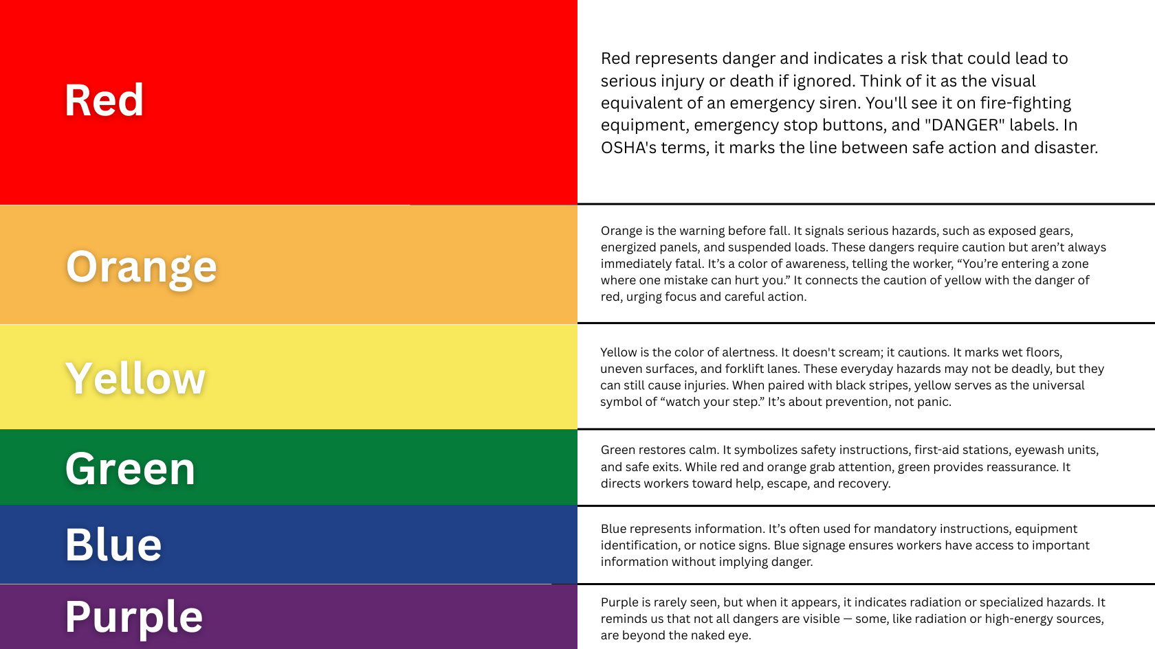
The ANSI Palette: Where Every Shade Tells a Story
Let’s decode this palette — not as a chart, but as a story about awareness, urgency, and response.
-
Red: The Sound of the Alarm
When a worker sees red, the message is clear: stop.
Red represents danger and indicates a risk that could lead to serious injury or death if ignored. Think of it as the visual equivalent of an emergency siren. You’ll see it on firefighting equipment, emergency stop buttons, and “DANGER” labels. In OSHA’s terms, it marks the line between safe action and disaster.
-
Orange
Orange is the warning before the fall. It signals serious hazards such as exposed gears, energized panels, and suspended loads. These dangers require caution but aren’t always immediately fatal. It’s a color of awareness, telling the worker, “You’re entering a zone where one mistake can hurt you.” It connects the caution of yellow with the danger of red, urging focus and careful action.
-
Yellow
Yellow is the color of alertness. It doesn’t scream; it cautions. It marks wet floors, uneven surfaces, and forklift lanes. These everyday hazards may not be deadly but can still cause injuries. When paired with black stripes, yellow serves as the universal symbol of “watch your step.” It’s about prevention, not panic.
-
Green
Green restores calm. It symbolizes safety instructions, first-aid stations, eyewash units, and safe exits. While red and orange grab attention, green provides reassurance. It directs workers toward help, escape, and recovery.
-
Blue
Blue represents information. It’s often used for mandatory instructions, equipment identification, or notice signs. Blue signage ensures workers have access to important information without implying danger.
-
Purple
Purple is rarely seen, but when it appears, it indicates radiation or specialized hazards. It reminds us that not all dangers are visible — some, like radiation or high-energy sources, are beyond the naked eye.
The Psychology Behind ANSI’s Palette
Colors are not just aesthetic choices in industrial settings; they are signals that shape how workers react under pressure. The ANSI palette was developed based on how the human brain processes cues about urgency and safety in fast-paced environments.
On a manufacturing floor, in a refinery, or at a logistics warehouse, decisions occur in a matter of seconds.
Here’s how each ANSI color uses human psychology to improve response time and reduce hesitation:
i) Red
Red has the longest wavelength, making it the first color the eye detects under stress. It quickly triggers the brain’s “stop or danger” response, which is essential for emergency equipment, fire controls, and high-voltage panels.
ii) Yellow
Yellow is the most visible color over long distances and in dim industrial lighting. This visibility is why it’s often used for floor markings, forklift lanes, and caution signs — areas where proactive attention helps avoid near-misses.
iii) Orange
Orange combines the intensity of red with the visibility of yellow, signaling “serious hazard; proceed with awareness.” It grabs attention without causing panic, making it ideal for machinery zones or maintenance alerts.
iv) Green and Blue
Green and blue occupy the cooler end of the spectrum, creating a sense of calm and clarity. These colors promote safe behavior by marking exits, first-aid stations, and information areas — places where employees need to focus rather than feel fear.
For industrial safety leaders, this palette is not about color theory; it’s about how neuroscience influences hazard perception. ANSI’s system transforms color from a visual element into a behavioral safety tool, ensuring that every shade on the shop floor prompts the correct response at the right moment.
When Color Meets Compliance
In the U.S., ANSI and OSHA work together. OSHA’s 29 CFR 1910.144 and 1910.145 adopt many of ANSI’s color definitions for physical hazard markings and safety signs.
If you’re a facility manager or safety director, following ANSI isn’t just a good idea — it demonstrates your commitment to safety.
How to Apply ANSI Color Codes in Workplaces
Every industry can integrate ANSI color codes into its environment. The key is consistency and context.
✔ In Manufacturing:
Use orange for machine guards and red for emergency stops. Yellow floor tape can guide foot traffic away from mobile equipment.
✔ In Construction:
Use red tags for lockout systems, orange cones for active hazard zones, and green signs to mark emergency exits.
✔ In Chemical Facilities:
Label containers using ANSI/OSHA-aligned colors for flammable, corrosive, or toxic materials. Green marks safety showers, while blue identifies information panels.
✔ In Corporate Facilities or Warehouses:
Combine blue “Notice” signs with yellow “Caution” floor zones to balance compliance and visual clarity.
What Are the Benefits of Color Coding?
For B2B companies, ANSI color codes provide more than just compliance — they enhance operational efficiency. Here’s how:
-
Reduced incidents: Quick recognition leads to fewer errors and injuries.
-
Higher productivity: Clear visual zones make movement and workflow smoother.
-
Improved audits: Inspectors can quickly recognize ANSI-compliant visual systems.
-
Stronger brand image: Clients view color-coded facilities as professional, safe, and efficient.
Conclusion
Colors are part of a universal visual language that extends beyond spoken instructions, helping workers easily recognize hazards. By adopting the ANSI Z535.1 color palette and integrating it into your signage, floor markings, training, and EHS systems, you equip your workforce with a strong visual cueing system. This system enhances hazard recognition, boosts compliance, and creates a safer workplace.
Leave A Comment